Animations are the heart of every modern mobile application. Not only they are important for the user's attention, they also play a major role in making the user experience better and memorable. In this tutorial, we'll share some examples of amazing animations done with the Vue Native framework. So, let's get started.

LOADER ANIMATION
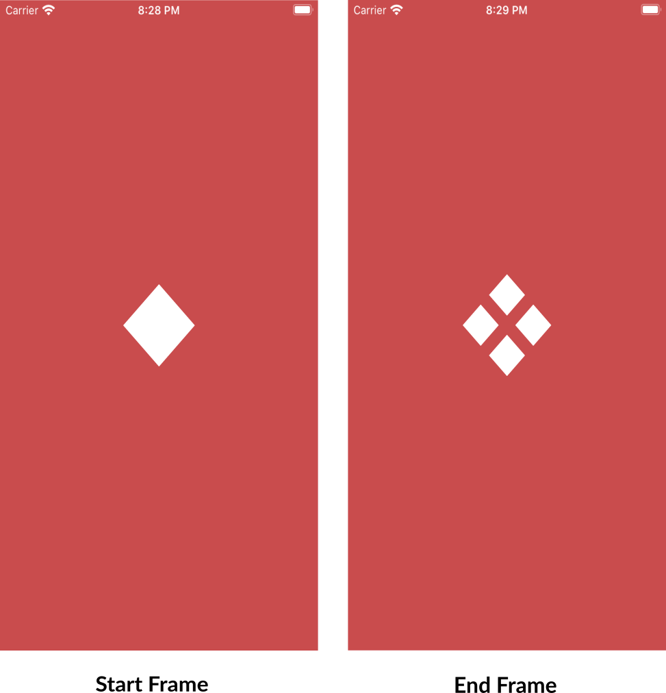
For accomplishing any kind of animation, designing start and end frames are important. Let's check out the start and the end frames of the animation below.

How it's done:
Let's start by creating the diamond-shaped box according to the start frame. For this, we can create a container
viewand rotate it by 45 degrees. Styling can be achieved in Vue Native using thestyleprop and defining classes in the<style>tag.For the end-frame styling, let's add two more views. Each child view we created can contain two views that will give us 4 views inside the main container view. Giving some margin to each box/view will exactly give us our required end-frame. Our Vue Native code till now will look like this:
<template>
  <view class="container">
    <view class="box" :style="{transform: [{rotate: '45deg'}]}">
      <view class="flex-row">
        <view class="small-box" />
        <view class="small-box" />
      </view>
      <view class="flex-row">
        <view class="small-box" />
        <view class="small-box" />
      </view>
    </view>
  </view>
</template>

<style scoped>
.flex-row {
  flex-direction: row;
}
.container {
  flex: 1;
  background-color: rgb(201, 76, 77);
  justify-content: center;
  align-items: center;
}
.box {
  position: absolute;
  width: 80;
  height: 80;
  align-items: center;
  justify-content: center;
}
.small-box {
  background-color: white;
  height: 30;
  width: 30;
}
</style>
After designing the start and end frames, we can be sure that the margin property will be required to achieve this animation. But how can we animate this in Vue Native? 🤔
In Vue Native, we use the Animated API of React Native with $options property of Vue Native to achieve animations. Animated provides us with a set of functions that help us configure our animations according to our needs. Let's check how to use it.
- Using Animated.Value:
Animated.Value(initialValue)is used as a constructor to initialize a new variable to use Animated API. Firstly we'll initialize the Value property of Animated API so that we could hook theanimated.Valueto any style property. We can add theanimated:prefix before the Vue Native template tags to hook the animated property as below:
<template>
  <animated:view :style="{ opacity: $options.animateOpacity }"/>
</template>
<script>
     export default {
        data () {
                 }
        animateOpacity:new Animated.Value(0)
      }
</script>
- Using Animated.timing(): To achieve time-based animation, we use the timing function of the Animated API. Let's check out its syntax:
Animated.timing(initialAnimatedValue,config)
The config object contains options like toValue and duration for the final value and duration of the animation. So, if we want to animate for a duration of 1 second, we can use:
Animated.timing(this.$options.animateOpacity,{
          toValue:1,
          duration:1000,
          useNativeDriver:false
        }).start()
- Using interpolate(): The interpolation allows us to map input ranges of animated value to desired output values. Let's check out the syntax below:
Animated.Value.interpolate({inputRange,outputRange})
- inputRange: an array of animated values in increasing order.
- outputRange: an array of the desired output animated values that will be mapped according to
inputRange.
For example, we have a scenario where we want to increase the size of the animated view along with fading-in the view. We can just use the interpolate method to hook to animated opacity value (the inputRange) with output width/height value as below:
<template>
  <animated:view :style="{ opacity: $options.animateOpacity, width: $options.animateWidth }"> </animated:view>
</template>

<script>
export default {
  animateOpacity: new Animated.Value(0),
  created() {
    this.$options.animateWidth = this.$options.animateOpacity.interpolate({
      inputRange: [0, 1],
      outputRange: [0, 100],
    })
  },
  mounted() {
    Animated.timing(this.$options.animateOpacity, {
      toValue: 1,
      duration: 1000,
    }).start()
  },
}
</script>
The above code declares outputRange of [0,100] for width/height. So, the width/height will go from [0,100] for opacity value of 0 to 1. The above code will generate output like this:

Now, since we know the required concepts 😎, let's apply the above methods to complete the loader animation as below.
<script>
import { Animated } from 'react-native'

export default {
    animateMargin:new Animated.Value(0),
    created () {
      this.$options.marginInterpolation = this.$options.animateMargin.interpolate({
        inputRange:[0,0.5,1],
        outputRange:[0,10,0]
      })
    },
    methods:{
      startAnimation () {
        Animated.timing(this.$options.animateMargin,{
          toValue:1,
          duration:1000,
          useNativeDriver:false
        }).start(()=>{
          this.$options.animateMargin.setValue(0)
          this.startAnimation()})
      }
    },
    mounted () {
      this.startAnimation()
    }
}
</script>
- In the above
<script>code, we've initialized the animated value asanimateMarginand using variablemarginInterpolationto store interpolation mapped values. We can see thatoutputRangeis going from halfway between 0 to 10 and coming back to 0. This is done to give a loader effect by interpolating the margin property. - In the
startAnimation()method, we are usingsetValue()function to reset the animated value and again calling thestartAnimation()method. This will make sure animation happens continuously. - At last, to hook the animated interpolation value to margin style property, we will update the above loader template as below and we're done.
<template>
  <view class="container">
    <view class="box" :style="{transform: [{rotate: '45deg'}]}">
      <view class="flex-row">
        <animated:view
          class="small-box"
          :style="{margin: $options.marginInterpolation}"
        />
        <animated:view
          class="small-box"
          :style="{margin: $options.marginInterpolation}"
        />
      </view>
      <view class="flex-row">
        <animated:view
          class="small-box"
          :style="{margin: $options.marginInterpolation}"
        />
        <animated:view
          class="small-box"
          :style="{margin: $options.marginInterpolation}"
        />
      </view>
    </view>
  </view>
</template>

Pretty easy right 😁!! Check out the full example here.
PROGRESS LOADER ANIMATION

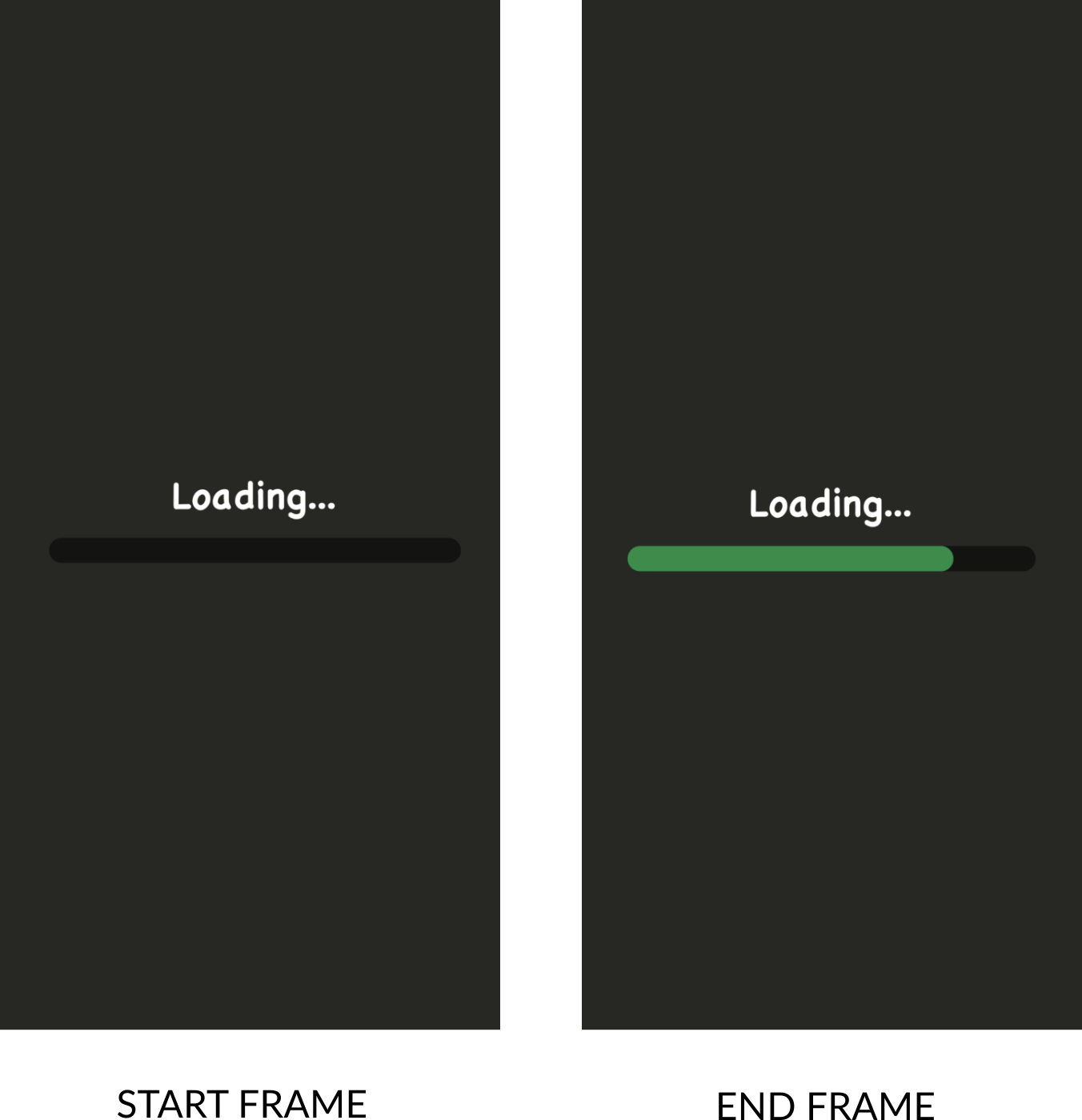
Looking at the start and end frames, we can make out that the width of the view should be animated. Let us see how to make it work.
- Let's code the basic UI for a progress loader. For this, we need two views, one parent view and one child view that should be in absolute position inside the parent view for showing the progress as shown in the end frame. The below template explains the styling for the progress loader.
<template>
  <safe-area-view :style="{flex: 1}">
    <view class="container">
      <view class="justify-center">
        <view class="progressBar">
          <animated:view
            class="absolute-fill"
            :style="{
              width: '80%',
            }"
          />
        </view>
      </view>
    </view>
  </safe-area-view>
</template>

<style>
.container {
  flex: 1;
  justify-content: center;
}
.white-text {
  color: white;
  font-weight: bold;
  font-size: 20;
}
.loading {
  align-items: center;
}
.progressBar {
  height: 20;
  width: 80%;
  background-color: rgba(0, 0, 0, 0.5);
  border-radius: 50px;
}
.absolute-fill {
  position: absolute;
  left: 0;
  right: 0;
  top: 0;
  bottom: 0;
  background-color: rgb(1, 142, 67);
  border-radius: 50;
}
.justify-center {
  align-items: center;
  justify-content: center;
}
</style>
- Now, for storing the animated value of the loader width, we can initialize a property called progress.
- Since we need to convert the animated value to usable width i.e. from 0% to 100%. Let's make a property called as
loaderWidththat should convert the input range [0,100] of progress to output range ['0%','100%']. - For storing the current progress of a task for example download progress, let's create a property called
progressValue. This property will allow us to reach a certain width only (for instance 0% to 10% depending upon the download progress). Since this property must be reactive, we place this inside data. Check out the full code below:
<script>
import { Animated, Platform } from 'react-native'

export default {
  data () {
    return {
      progressValue:0,
    }
  },
  progress:new Animated.Value(0),
  created: function () {
    this.$options.loaderWidth = this.$options.progress.interpolate({
      inputRange: [0, 100],
      outputRange: ['0%', '100%'],
      extrapolate: 'clamp',
    })
  },
  mounted () {
    this.startAnimation ()
  },
  watch: {
    progressValue: function () {
      Animated.timing(this.$options.progress, {
        toValue: this.progressValue,
        duration: 1000,
        useNativeDriver: false,
      }).start()
    },
  },
  methods:{
    startAnimation() {
      this.loaderWidthTimer = setInterval(()=>{
        if(this.progressValue >= 100) {
          clearInterval(this.loaderWidthTimer)
        }
        this.progressValue = this.progressValue + 10
      },200)
    }
  }
}
</script>
To mimic a progress loader for any task, we've added progressValue as a watch property in the above code. This will make sure whenever progressValue increases, the width is animated accordingly.
Now, let us add a function to manipulate the progressValue from 0 to 100 as shown above in the startAnimation() function. As soon as progressValue changes, we animate the current value of animated width to the new progress value.
Lastly, we can hook the loaderWidth to the <animated:view> we created in the <template> as:
<animated:view class="absolute-fill" :style="{ width: $options.loaderWidth }"/>

Just check out this link for complete implementation. Now, let's jump to our last example.
HEADER-SCROLL ANIMATION
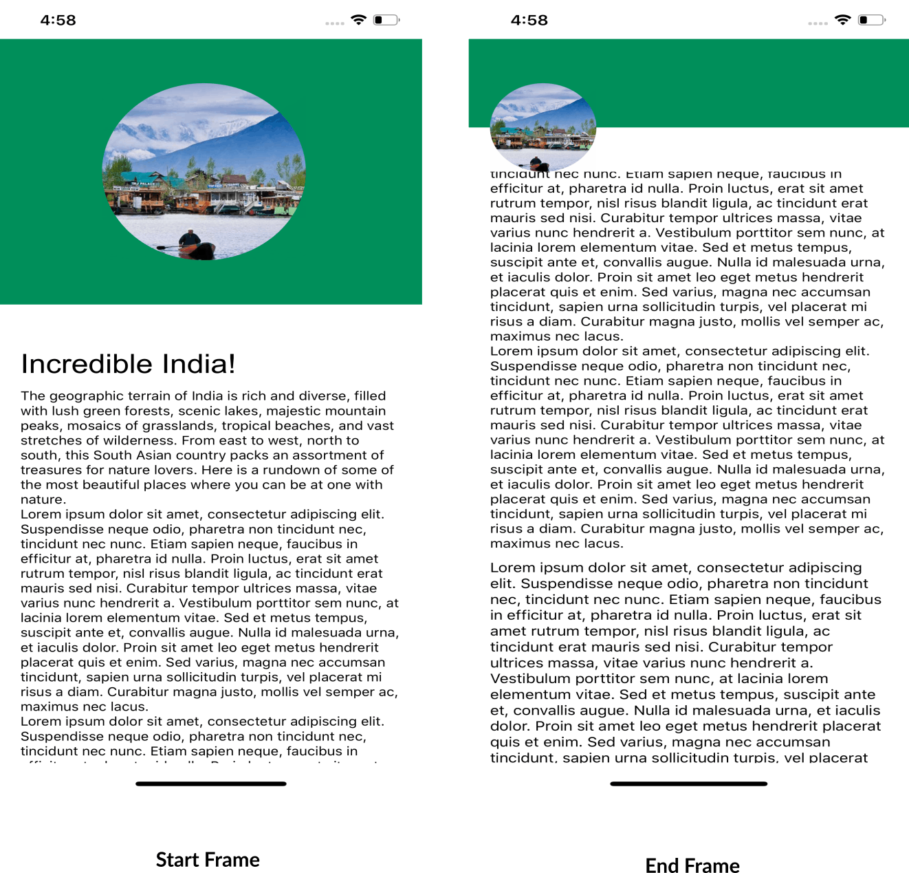
In this example, we will animate components like image, view, etc on the user's scroll event. First, let's look at the start and the end frames of animation.

Looking at the start and the end frames, we can say that the below properties should be animated to complete this header scroll transition:
- Height ( header, image )
- Width ( image )
- border Radius ( image )
- Position ( image )
Let's check out the steps to do it:
- Since the values for the above properties will be decided by the current scroll value at the instance, we should save the scroll values somewhere, let us add a variable called scrollY to
$options. - For image size (height and width), let's add a variable called animatedSize and we can use the interpolate function to map the output height and width values according to the input scroll range.
- Similarly, we can do it for image position and header height. The code till now will look like below.
<script>
import lake from './assets/lake.jpg'
import { Animated } from 'react-native'

export default {
  data () {
    return {
      Animated,
      lake,
    }
  },
  scrollY:new Animated.Value(0),
  created () {
    this.$options.animatedSize = this.$options.scrollY.interpolate({
      inputRange:[0,100],
      outputRange:[200,100],
      extrapolate:'clamp'
    })
    this.$options.imagePosition = this.$options.scrollY.interpolate({
      inputRange:[0,100],
      outputRange:[100,20],
      extrapolate:'clamp'
    })
    this.$options.headerHeight = this.$options.scrollY.interpolate({
      inputRange:[0,100],
      outputRange:[300,100],
      extrapolate:'clamp'
    })
  },
}
</script>
- Now, we can add the template and assign the above interpolation values to it.
- The Animated.event function will give us the animated values for the y-position of
animated:scroll-view. Let's check out the full code example below.
<template>
  <safe-area-view :style="{flex: 1}">
    <view class="container">
      <animated:image
        :source="lake"
        :style="{
          position: 'absolute',
          zIndex: 1,
          height: $options.animatedSize,
          width: $options.animatedSize,
          borderRadius: $options.animatedSize,
          left: $options.imagePosition,
          top: 50,
        }"
      />
      <animated:view
        :style="{
          backgroundColor: 'rgb(0, 143, 90)',
          flexDirection: 'row',
          width: '100%',
          height: $options.headerHeight,
        }"
      >
      </animated:view>
      <view class="middle-view"> </view>
      <animated:scroll-view
        :on-scroll="
          Animated.event([
            {
              nativeEvent: {
                contentOffset: {
                  y: $options.scrollY,
                },
              },
            },
          ])
        "
        :content-container-style="{paddingLeft: 20, paddingRight: 20}"
      >
        <view>
          <text class="cursive-text" :style="{fontSize: 30}"
            >Incredible India!</text
          >
             ...content
        </view>
      </animated:scroll-view>
    </view>
  </safe-area-view>
</template>

<script>
import lake from './assets/lake.jpg'
import { Animated } from 'react-native'

export default {
  data () {
    return {
      Animated,
      lake,
    }
  },
  scrollY:new Animated.Value(0),
  created () {
    this.$options.animatedSize = this.$options.scrollY.interpolate({
      inputRange:[0,100],
      outputRange:[200,100],
      extrapolate:'clamp'
    })
    this.$options.imagePosition = this.$options.scrollY.interpolate({
      inputRange:[0,100],
      outputRange:[100,20],
      extrapolate:'clamp'
    })
    this.$options.headerHeight = this.$options.scrollY.interpolate({
      inputRange:[0,100],
      outputRange:[300,100],
      extrapolate:'clamp'
    })
  },
}
</script>

<style>
.container {
  background-color: white;
  flex: 1;
}
.text-color-primary {
  color: blue;
}
.middle-view {
  height: 50;
}
.cursive-text {
  font-family: arial;
}
</style>
The animation turned out as below:

In the above examples, we learned how to accomplish different kinds of animations in Vue Native. Now let us look at the best practices that can be followed for handling them.
BEST PRACTICES/FACTS
As we saw above, animations in Vue Native are really easy to accomplish. Few points we should keep in mind while doing animations.
- The reason behind mostly using
$optionsfor animations is the stateful nature of Animated API. Since Animated API contains a state of itself to manage the animations, declaring it as adataorcomputedproperty (which are used to store reactive data and its derived state) leads to unnecessary re-renders of the view which can cause performance drops and sometimes even challenging to debug for any issues. So, always try to use$options. - If we are animating non-layout properties like opacity, etc, always add the useNativeDriver option so that animation happens at the native layer.
- At last, clear all the timeouts and intervals if used for any animation purposes before the component unmounts to avoid memory leaks in your app.🙂
Keeping in mind the above points, you’ll be able to create awesome animations in Vue Native.
Check out this repo for the complete implementation of the above examples. https://github.com/anmoljain10/VueNativeAnimations
Thank You for reading!

