

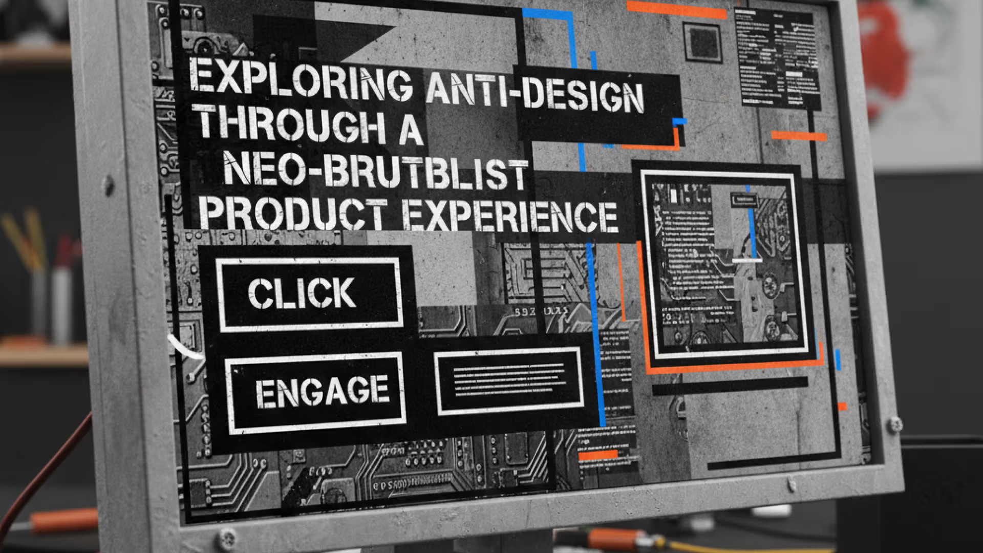
Exploring Anti-Design Through a Neo-Brutalist Product Experience
Discover how neo-brutalism is shaping 2026 design trends. See how anti-design principles can create distinct, usable, and memorable product experiences.
Search for a command to run...
Discover how neo-brutalism is shaping 2026 design trends. See how anti-design principles can create distinct, usable, and memorable product experiences.
No comments yet. Be the first to comment.
When code breaks a pipeline, developers have to stop working and figure out why. This blog shows how an AI agent reads the error, finds the fix, and submits it for review all on its own.
GeekyAnts built a 5-agent fraud detection pipeline that makes decisions in under 200ms — 15x cheaper than single-model systems, with full explainability built in.

A deep dive into how GeekyAnts built a real-time AI fraud detection system that evaluates transactions in milliseconds using a hybrid multi-agent approach.

A deep dive into how GeekyAnts built an AI-powered Code Healer that analyzes CI/CD failures, summarizes logs, and generates code-level fixes to keep development moving.

GeekyAnts Tech Blog
347 posts
GeekyAnts is an AI-powered digital product engineering and consulting company helping startups, enterprises, and Fortune 500 brands build scalable, future-ready digital solutions. Since 2006, we have delivered 800+ successful projects for 550+ global clients across healthcare, BFSI, retail, logistics, education, and enterprise technology. We help businesses accelerate digital transformation through strategy, design, engineering, and AI-led innovation.
A comprehensive article on customising design systems, experimenting responsibly, and designing with intention in 2026's most defining trend.
Most modern digital products are well designed. They are clean, usable, and follow best practices. Yet somewhere along the way, many of them started feeling interchangeable, polished to the point of sameness.
During our early project discussions, one question kept surfacing: How do we create something that feels distinct without sacrificing usability?
That tension became our entry point into anti-design—not as a visual trend to adopt, but as a design method to explore.
Anti-design has emerged as one of the dominant design trends of 2026, representing a fundamental shift in how designers approach their craft. After years of algorithm-friendly, hyper-polished aesthetics, the design community is experiencing what many are calling a creative rebellion.
Industry leaders are witnessing a deliberate rejection of AI's overly smooth visual language in favour of work that feels unmistakably human. Designers are choosing imperfection, messiness, and rawness as proof that a person, not an algorithm, made this. This is not only an aesthetic preference; it is a response to digital saturation and a hunger for authenticity.
The data backs up this shift:
Searches for bold fonts have surged over 65%
Collage art and handmade textures continue to climb in popularity
Brands are moving away from safe, predictable design toward experiences that feel alive, emotional, and intentionally chaotic
This article documents how we rode this wave early by understanding anti-design as a principled methodology that could help us stand out in an increasingly homogenised market.
Anti-design typically appears late in the process, applied as visual flair over an already-finished product. We took a different approach.
We chose to explore anti-design from the beginning, working at the system level rather than the surface level. Instead of discarding our design system, we used it as a foundation and began questioning its assumptions:
What happens when typography leads instead of layout?
What if spacing becomes expressive, not just consistent?
What if components feel editorial rather than purely functional?
These questions shaped our early explorations and helped us test boundaries without losing control.
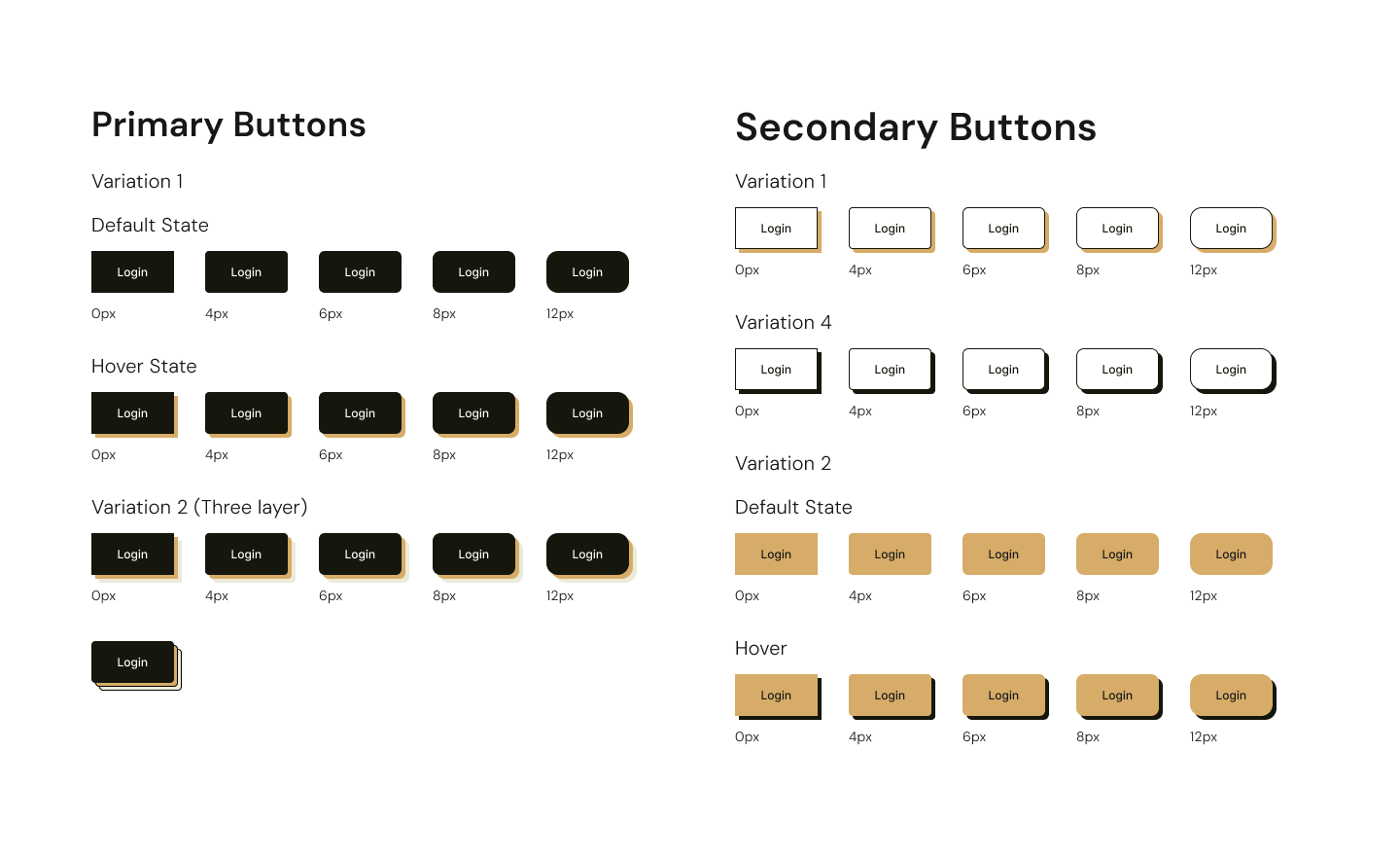
Early explorations showing multiple variations of the same screen or layout concept
The challenge was not to push boundaries; it was how to do it without creating chaos.
Rather than changing everything at once, we focused on small, deliberate experiments:
Modified Button types to start establishing the new brutalism softly on the screen
Introduced layout flexibility for content-heavy sections
Created component variants instead of entirely new patterns
For example, we did not build new card components from scratch. Instead, we experimented with existing ones by introducing heavier borders, uneven internal spacing, and Bolder and larger typographic contrast.
This kept us system-aligned while allowing the visual language to evolve.
Neo-brutalism gave us a middle ground between expressive design and functional usability.
Unlike traditional brutalism, which can feel harsh or inaccessible, neo-brutalism allows you to use bold typography without harming readability, create visual tension without confusion, and embrace rawness while maintaining structure.
For us, this approach supported a magazine-inspired experience where content felt curated and intentional, not templated and generic.
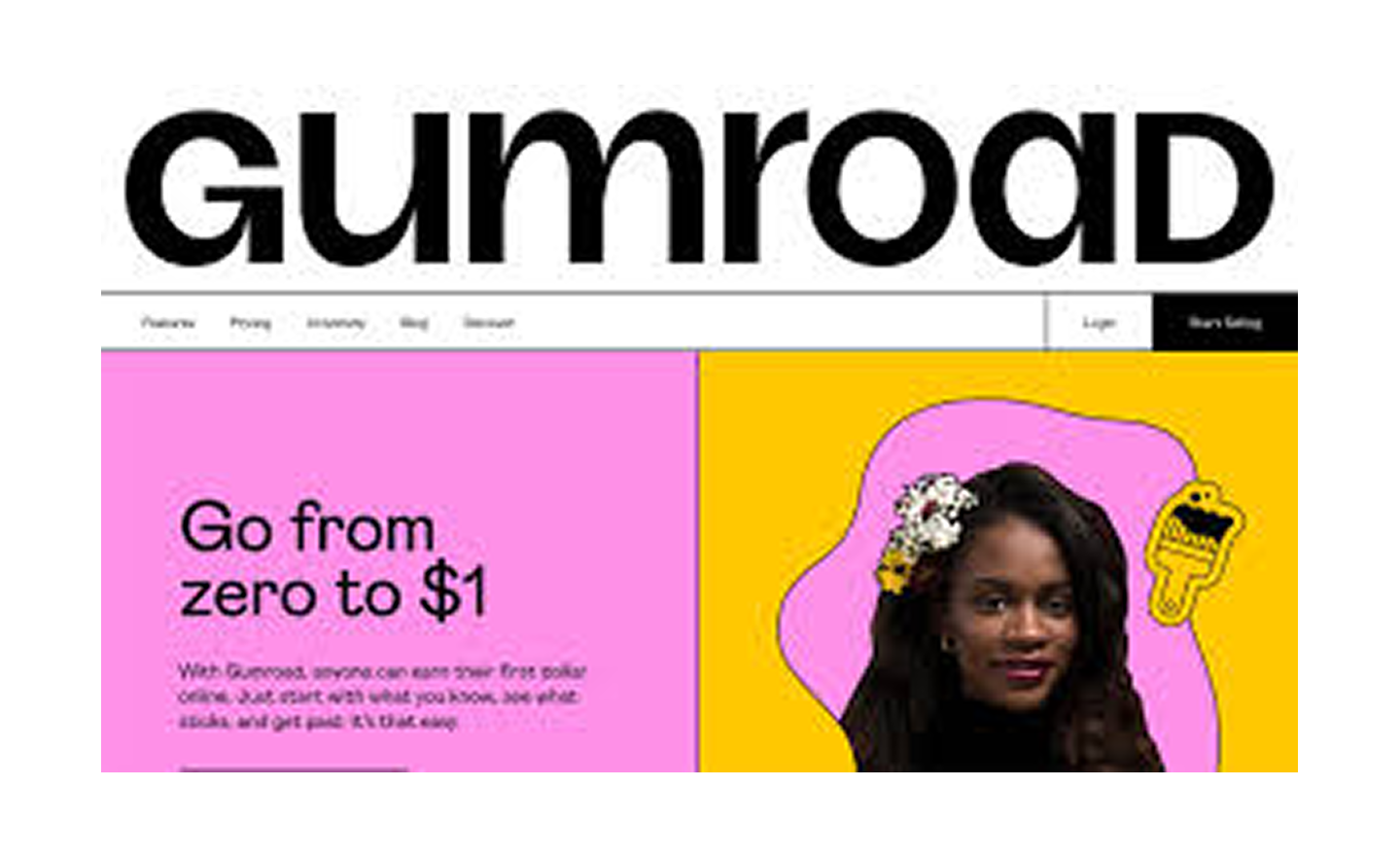
Platforms like Figma and Gumroad have embraced neo-brutalist approaches, demonstrating how raw, unpolished aesthetics can succeed in commercial contexts.
Figma's brand refresh uses bold contrasts and unconventional typography to emphasize creative freedom and flexibility, perfectly aligning with their design tool's purpose. The visual language reinforces what the product enables—unrestricted creativity.
Gumroad's raw aesthetic aligns with its mission of empowering independent creators. The rebellious visual language communicates that it is a platform for people charting their own paths, not another corporate marketplace. The deliberately utilitarian interface becomes part of the brand promise.
These are strategic decisions that align visual identity with brand values, proving that neo-brutalism works when it serves a purpose beyond shock value.
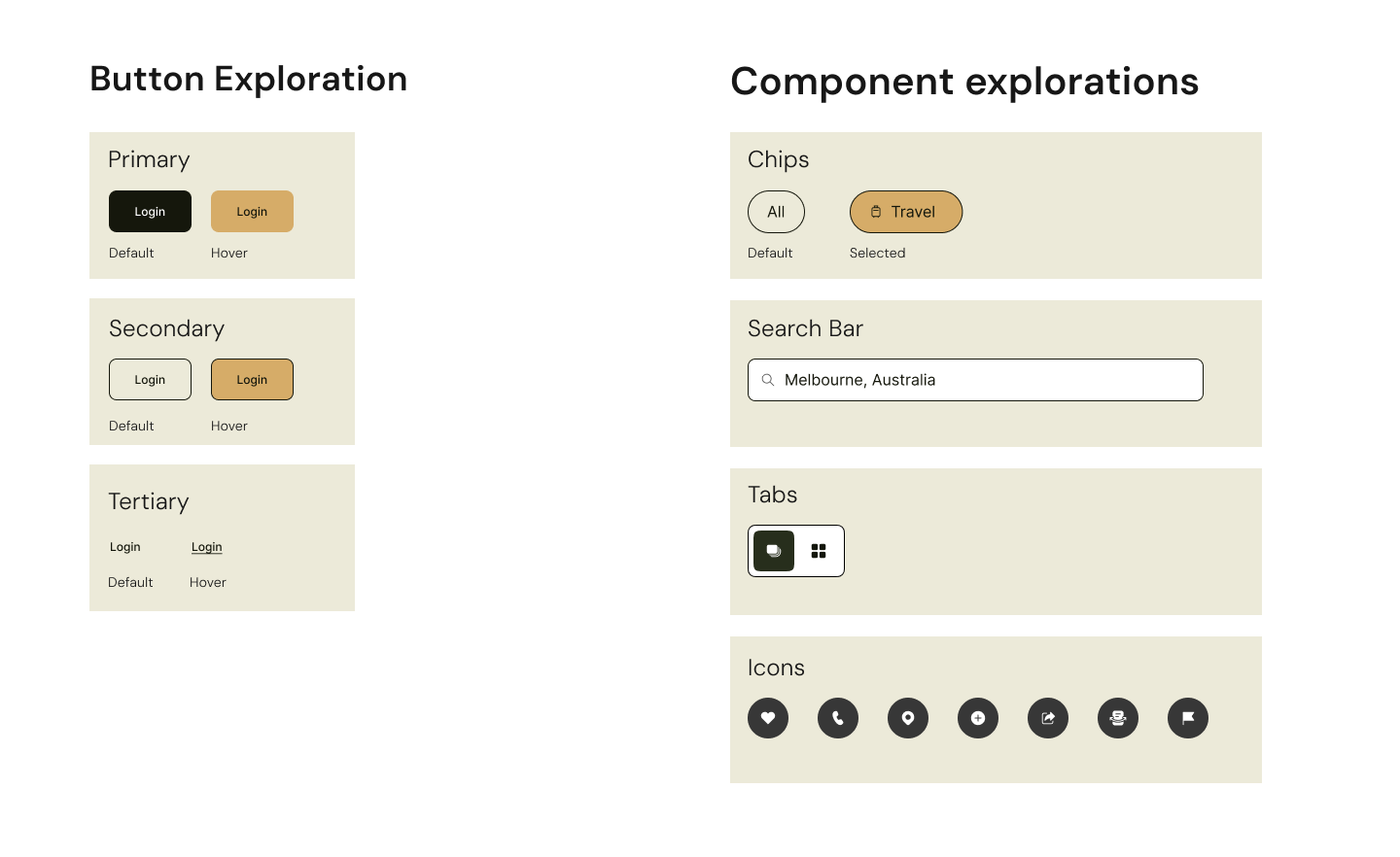
Typography scale experiments or layout blocks showing editorial influence
There's solid research backing why anti-design captures attention. The Von Restorff Effect, a psychological principle documented by German psychiatrist Hedwig von Restorff in 1933, demonstrates that when multiple similar items are presented, the one that differs from the rest is significantly more likely to be remembered.
In a world where users spend an average of 15 seconds on a webpage, shock value works. A brutalist design does not ask for attention it demands it. The distinctive nature of anti-design creates what psychologists call enhanced memory encoding, making experiences more memorable than conventional alternatives.
When users encounter something unexpected:
Their brain registers the deviation from the norm
Additional cognitive resources are allocated to processing it
The experience becomes more deeply encoded in memory
Recall is significantly improved compared to conventional alternatives
This is a measurable impact on user engagement and brand recall, translating to higher engagement metrics, stronger word-of-mouth sharing, and more memorable user experiences.
Anti-design that ignores fundamental principles is just bad design with a rebellious aesthetic. True anti-design respects these principles while finding new ways to express them.
This is non-negotiable. WCAG (Web Content Accessibility Guidelines) organizes accessibility requirements under four principles: content must be Perceivable, Operable, Understandable, and Robust.
Anti-design does not exempt you from these standards—it challenges you to meet them creatively.
Maintain a minimum contrast ratio of 4.5:1 for normal text and 3:1 for large text
Bold typography and heavy borders can work if contrast ratios are maintained
Use tools like WebAIM's contrast checker to verify compliance
Keep body text at minimum 16px
Ensure generous line height (1.5x minimum)
Avoid extremely condensed or decorative fonts for body copy
Bold, expressive headlines are fine—just keep body text readable
All interactive elements must be keyboard-accessible
Visible focus indicators are required (not just on hover)
Logical tab order must be maintained even with unconventional layouts
All images need descriptive alt text
Ensure heading hierarchy (H1, H2, H3) follows logical structure
Do not break semantic HTML structure for visual effect
Interactive elements must be at least 44x44 pixels
Even if your design feels raw, buttons must be easily tappable/clickable
Low-contrast text might look sophisticated but excludes users with visual impairments and violates legal standards.
Experimental layouts are fine, but users must always know how to navigate and complete tasks.
Use additional indicators like icons, labels, or patterns alongside color.
Buttons should look clickable, links should be distinguishable, forms should be predictable.
If you include animations, provide pause/stop controls and respect prefers-reduced-motion settings.
Gumroad's raw aesthetic includes heavy borders and bold typography, but maintains proper contrast ratios and clear interactive states. The visual rebellion works because the accessibility fundamentals remain intact.
The principle is to push visual boundaries, not accessibility boundaries.
Jakob Nielsen's 10 Usability Heuristics, developed in 1990 and refined in 1994, remain the gold standard for interface design. Anti-design does not reject these principles—it interprets them differently.
Anti-design can actually enhance this through bold, unmissable feedback states. Heavy borders and strong typography make status changes more visible, not less.
Neo-brutalism often embraces real-world metaphors—raw materials, physical textures, tactile elements. This can create stronger connections than sterile digital interfaces.
Unconventional does not mean confusing. Clear "undo" actions, visible navigation, and predictable controls still apply—they just might look different.
This is where anti-design requires the most discipline. You can bend conventions, but you must be consistent within your own system. If one button has a heavy border, all buttons should follow a predictable pattern.
Bold visual treatments can actually improve error prevention by making warnings more noticeable and actions more deliberate.
Strong visual hierarchy and distinctive elements aid recognition. Anti-design's boldness can reduce cognitive load by making important elements impossible to miss.
Power users benefit from predictable patterns. Anti-design can support efficiency through clear visual affordances and consistent interaction models.
This seems contradictory, but it is not. The heuristic is about ensuring that visual elements support user goals, not about adhering to flat design. Bold typography can create a clearer hierarchy than minimalist layouts if used intentionally.
Heavy borders, bold text, and strong colour can make error messages more noticeable and actionable.
Even rebellious designs need clear documentation. The visual language might be unconventional, but the help content must remain accessible and searchable.
Traditional design applies heuristics conservatively. Anti-design applies them expressively—but it still applies them. The rebellion is in the execution, not the abandonment of principles.
Anti-design is not universally applicable, but it can be powerful when used intentionally.
Differentiation is a key product goal
Brand personality matters
Content needs to feel expressive or editorial
Your audience is open to visual experimentation
Speed and efficiency are the primary user goals
Accessibility constraints are extremely strict
Users rely on predictable patterns under high-pressure conditions
The key is knowing when expression adds value—and when it becomes noise.
If you are curious about anti-design but hesitant to try it in live projects, here is how to start:
Experiment early: Explore unconventional ideas before the system becomes locked in.
Isolate risk: Test bold ideas on a few screens or components, not the entire product.
Use the system as a base: Bend components before you replace them entirely.
Document intent: Be prepared to explain every rule you break.
Balance expression with restraint: Not everything needs to be loud. Some elements should anchor the chaos.
This project reinforced several principles worth carrying forward:
Design systems should enable exploration, not restrict it
Intentional experimentation leads to stronger outcomes than random novelty
Anti-design works best when grounded in purpose, not rebellion
Expression and usability do not have to compete—they can complement each other
Accessibility and heuristics are creative challenges
Anti-design is the design philosophy defining 2026. As the industry moves away from algorithmic perfection and toward human authenticity, designers who understand this shift will create experiences that truly resonate.
Our exploration proved that anti-design is not about rejecting structure—it's about reshaping it with intention. When approached thoughtfully, it helps you move beyond visual sameness and create experiences that feel memorable, expressive, and purposeful.
In a market flooded with polished sameness, imperfection has become the new differentiator. The brands and products that will stand out in 2026 are not the ones with the cleanest interfaces—they are the ones with personality, emotion, and unmistakable human touch.
Sometimes, the most impactful design decisions begin with a simple question:
What if we did not do it the usual way?
In 2026, that question is essential.
This article was originally published on the GeekyAnts blog.